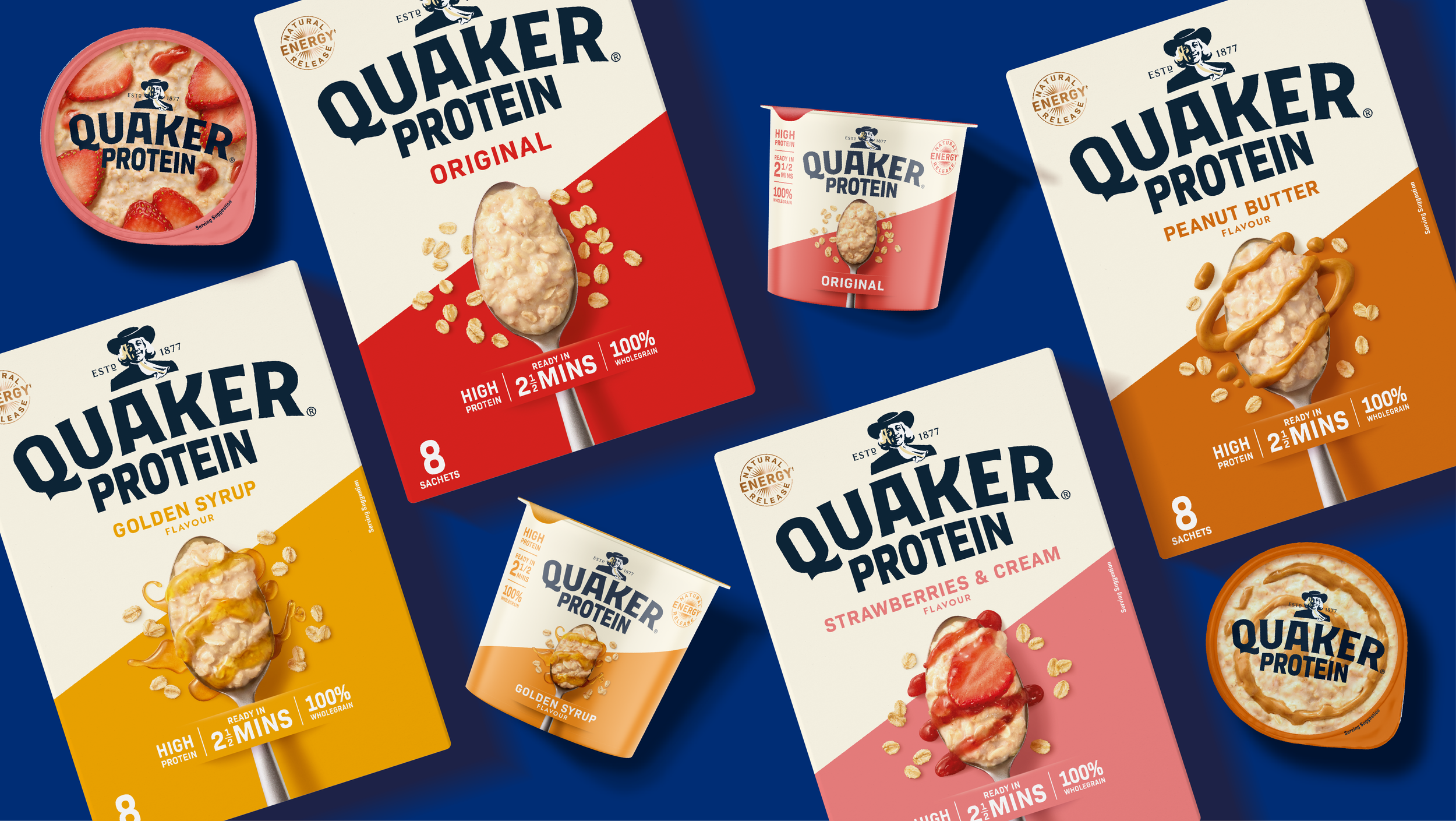
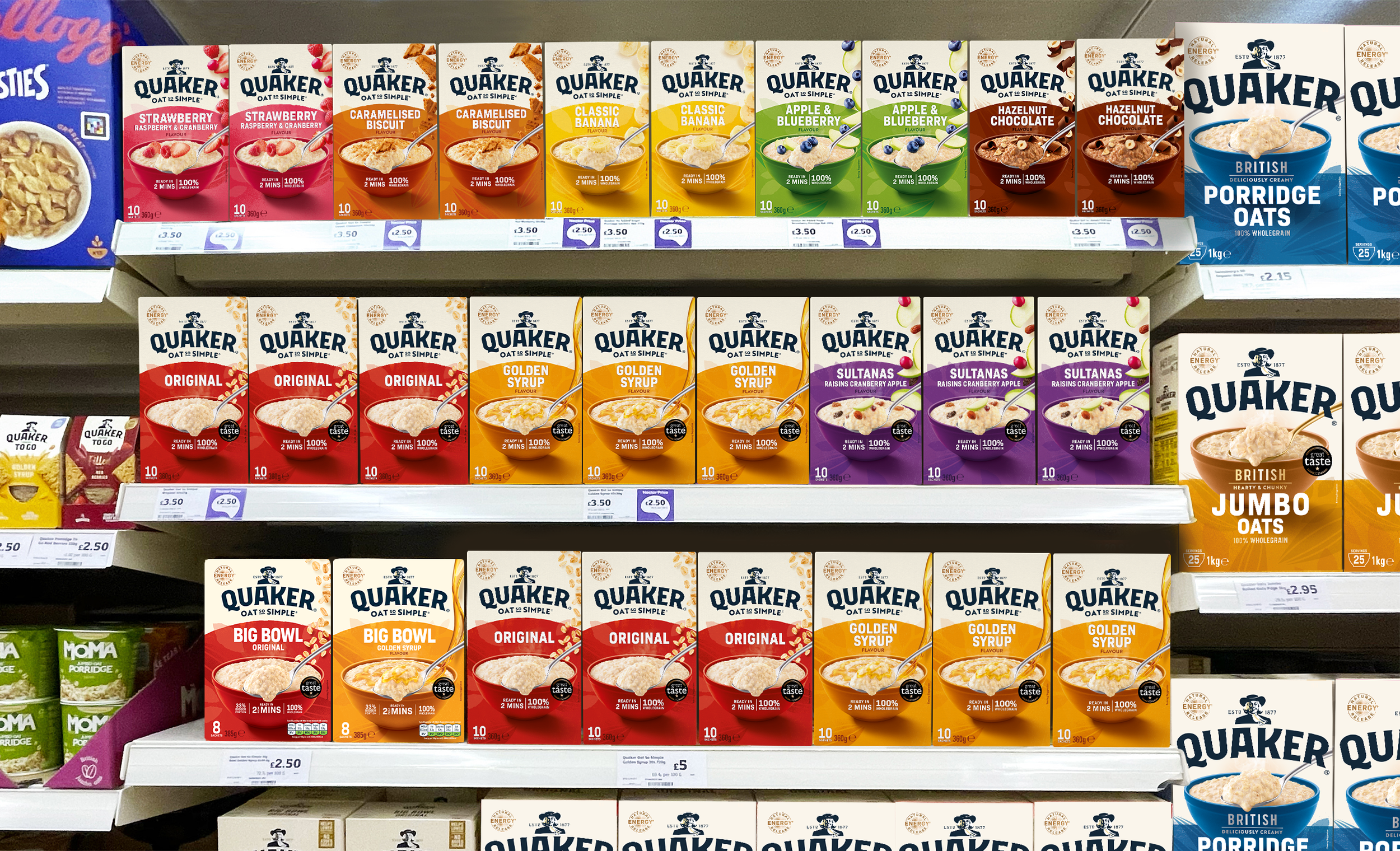
Quaker Restage
Quaker Oats has stood as a symbol of warmth, nourishment, and trust for generations. Our creative restage reimagines this beloved brand for today’s health-conscious, design-savvy UK consumer — bringing new life to the familiar while preserving what makes. The new pack architecture simplifies and elevates. Clean, oat backgrounds signal health, while fruity accent colours taking on an individual horizon lines, distinguish each product line. Bold typography improves readability while hero imagery is now styled with natural lighting and falling fruits, focusing on the perfect spoonful of hearty oats.